-1.png?width=240&height=100&name=Heading%20(2)-1.png)
Better.AI is not just one screen. It is spread out through the platform, each answering a different question, and each one shows up where that question gets asked rather than in a section you have to remember to visit. This article walks through all five with worked examples, so you can see the shape of what arrives before you turn anything on.
Everything below is an example, not anybody's real data. The figures are made up, but the layout, the wording and the arithmetic are the real ones. Where a number is derived, the article shows the derivation, because that is what the product does too.
One donor, Margaret Hale, runs through several of these examples on purpose. The same finding about the same person surfaces differently depending on which screen you are standing on, and seeing that is most of the point.
The five, in one table
| SCREEN | WHERE IT APPEARS | THE QUESTION IT ANSWERS | WHEN IT RUNS |
|---|---|---|---|
| Donor summaries and plans | On a contact record | Who is this person, and what should I do about them? | When you press the button |
| Recommendations | Dashboard, Recommendations tab | What across my whole database needs attention? | Overnight, and on demand |
| Today's suggested actions | Dashboard, under the stats | Of all that, what do I do first? | Reads the overnight findings |
| How you compare | Dashboard, How you compare tab | Was that good, or only familiar? | Recalculated periodically |
| Event health | Dashboard, Event health tab | Is this event on track while I can still fix it? | On page load, against your own past events |
Donor summaries and plans
This one lives on the contact record, in a card headed Better.AI, and it is the only one of the five you trigger by hand. It offers two things: a donor summary, which is where they stand right now, and a cultivation plan, which is what to do next and the ask their history supports.
Both are written from a fixed sheet of facts pulled off the record first. The model's job is the sentence, not the arithmetic, and it cannot mention a gift that is not on the sheet.
What it looks like on the contact record
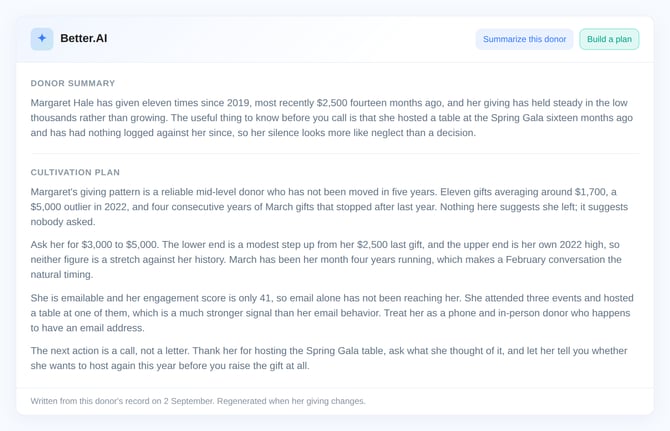
Example, not your data. The summary and the plan are shown together here; in the app each appears when you press its button.
The facts it is given
Example, not your data.
| Name | Margaret Hale |
| Lifetime giving | $18,400 across 11 gifts |
| First gift | March 2019 |
| Last gift | $2,500, 14 months ago |
| Largest gift | $5,000 |
| Recurring | No |
| Events attended | 3 |
| Opportunity score | 78 out of 100 |
| Engagement score | 41 out of 100 |
| Last logged activity | Table host, Spring Gala, 16 months ago |
| Emailable | Yes |
What the summary looks like
Two sentences: what stands out, and the single most useful thing to know before you contact them.
Margaret Hale has given eleven times since 2019, most recently $2,500 fourteen months ago, and her giving has held steady in the low thousands rather than growing. The useful thing to know before you call is that she hosted a table at the Spring Gala sixteen months ago and has had nothing logged against her since, so her silence looks more like neglect than a decision.
What the plan looks like
Four short paragraphs, addressed to you rather than to the donor: what the pattern shows, what to ask for and roughly when, which channel suits them, and one concrete next action. The ask is always a range with its basis stated, so you can disagree with the basis rather than the number.
Margaret's giving pattern is a reliable mid-level donor who has not been moved in five years. Eleven gifts averaging around $1,700, a $5,000 outlier in 2022, and four consecutive years of March gifts that stopped after last year. Nothing here suggests she left; it suggests nobody asked.
Ask her for $3,000 to $5,000. The lower end is a modest step up from her $2,500 last gift, and the upper end is her own 2022 high, so neither figure is a stretch against her history. March has been her month four years running, which makes a February conversation the natural timing.
She is emailable and her engagement score is only 41, so email alone has not been reaching her. She attended three events and hosted a table at one of them, which is a much stronger signal than her email behavior. Treat her as a phone and in-person donor who happens to have an email address.
The next action is a call, not a letter. Thank her for hosting the Spring Gala table, ask what she thought of it, and let her tell you whether she wants to host again this year before you raise the gift at all.
A thin record says so. A contact with no gifts, no events and no logged activity gets a note saying there is not enough here to work from, rather than a confident paragraph about nothing.
Once written, an artifact is kept and shown again for free. It is regenerated when the donor's facts actually move, and a stale one is never displayed next to a giving history that disagrees with it.
Recommendations
Overnight, twenty checks run across your donors, recurring gifts, pledges, memberships and events. What they find lands on the Recommendations tab, newest run at the top, with the figures behind each finding attached to it.
Each card carries a rank, the subject, a category badge, the sentence explaining the finding, and the numbers it was derived from. The tab tells you when it last ran and lets you run it again.
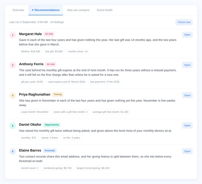
Example, not your data. The real tab shows the same five parts on every row.
| # | FINDING | WHAT IT SAYS | THE FIGURES BEHIND IT |
|---|---|---|---|
| 1 | Margaret Hale At risk |
Gave in each of the last four years and has given nothing this year. Her last gift was 14 months ago, and the two years before that she gave in March. | lifetime $18,400 last gift $2,500 months since 14 |
| 2 | Anthony Ferris At risk |
The card behind his monthly gift expires at the end of next month. It has run for three years without a missed payment, and it will fail on the first charge after that unless he is asked for a new one. | $150 per cycle expires March 2026 last paid 2 Feb |
| 3 | The Ashcroft Foundation At risk |
A gift of $5,000 arrived nine days ago and is still marked unacknowledged. They have given every year since 2019. | gift $5,000 days since 9 lifetime $41,000 |
| 4 | Priya Raghunathan Timing |
She has given in November in each of the last four years and has given nothing yet this year. November is five weeks away. | usual month November 4 years running average $1,200 |
| 5 | Daniel Okafor Opportunity |
Has raised his monthly gift twice without being asked, and gives above the level most of your monthly donors sit at. | monthly $75 raised 2 times on file 3 years |
| 6 | Elaine Barros Anomaly |
Two contact records share this email address, and her giving history is split between them, so she sits below every threshold on both. | records 2 combined $9,750 largest $6,100 |
| 7 | Spring Gala Timing |
Registrations are running behind where last year's gala sat at the same point, with six weeks left to close the gap. | registered 88 last year 141 days out 42 |
The four badges are the only categories there are. At risk is money you are about to lose, Opportunity is money on the table, Timing is a window that is open now, and Anomaly is something in the data worth looking at.
Marking a card done removes it from this tab and from Today's suggested actions, so the same donor does not come back on two consecutive mornings.
Today's suggested actions
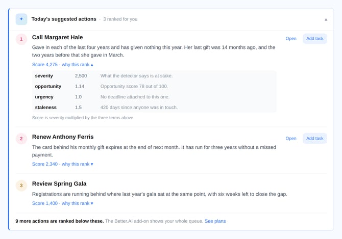
Recommendations tells you everything. This tells you what to do first. It sits under the stats on your dashboard as a single strip and opens into a ranked queue.
It is the same findings, so nothing new is computed here. What is added is an order, and the order is arithmetic rather than a model's opinion. Every row shows its own score and will break that score down on request, because a ranking nobody can audit is one people stop trusting after the first row they disagree with.
Example, not your data.
| # | ACTION | WHY IT IS HERE | SCORE |
|---|---|---|---|
| 1 | Call Margaret Hale | Gave in each of the last four years and has given nothing this year. | 4,275 |
| 2 | Renew Anthony Ferris | The card behind his monthly gift expires at the end of next month. | 2,340 |
| 3 | Review Spring Gala | Registrations are running behind where last year's gala sat at the same point. | 1,400 |
The verb comes from the kind of finding it is, so the row tells you what sort of work it is before you open it: Call, Email, Thank, Ask, Merge, Renew, Follow up, Make contact, Move forward or Review.
Opening "why this rank"
Every row expands into its own arithmetic. This is row 1 above.
Example, not your data.
| TERM | VALUE | WHY |
|---|---|---|
| severity | 2,500 | What the detector says is at stake. |
| opportunity | 1.14 | Opportunity score 78 out of 100. |
| urgency | 1.0 | No deadline attached to this one. |
| staleness | 1.5 | 420 days since anyone was in touch. |
Score is severity multiplied by the three terms above: 2,500 × 1.14 × 1.0 × 1.5 comes to 4,275. Severity is in dollars wherever a finding can express one, which is deliberate. It means a large lapse outranks a soft engagement signal, and the three multipliers are deliberately small and bounded so they reorder rows within a band without ever lifting a trivial finding above a serious one.
Urgency is the one term allowed to move a row a long way. Inside seven days it doubles the score, inside a fortnight it is 1.6, inside a month 1.3. Something that must happen this week and something that can happen this quarter are not the same work, however similar the amounts.
If gift officers have assigned portfolios, the queue filters the donor rows to yours. Findings that belong to nobody, an event running behind or a concentration problem, stay in every queue, since dropping them would quietly hide the organization-level work.
Add task writes the row out as a real task on the contact and marks the finding handled, so it does not return tomorrow.
How you compare
Your own reports tell you what you raised. This tells you whether it was good, by comparing you against organizations raising about what you raise.
Ten metrics are compared: average gift, median gift, donor retention, second gift conversion, recurring share, recurring churn, reliance on your largest donors, pledge fulfillment, seat fill rate and revenue per attendee.
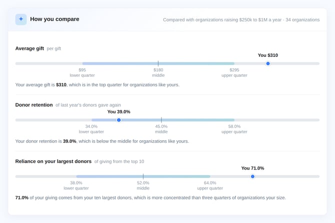
Each one shows your figure against the lower quarter, middle and upper quarter of your peer band, then says in a sentence where you landed.
Example, not your data.
| METRIC | YOU | LOWER QUARTER | MIDDLE | UPPER QUARTER |
|---|---|---|---|---|
| Average gift per gift |
$310 | $95 | $180 | $295 |
| Donor retention of last year's donors who gave again |
39.0% | 34.0% | 45.0% | 58.0% |
| Reliance on your largest donors of giving from the top 10 |
71.0% | 38.0% | 52.0% | 64.0% |
Underneath each one sits the sentence, which matters because the direction is not the same for every metric:
- Your average gift is $310, which is in the top quarter for organizations like yours.
- Your donor retention is 39.0%, which is below the middle for organizations like yours.
- 71.0% of your giving comes from your ten largest donors, which is more concentrated than three quarters of organizations your size.
That third one is the reason the wording is written per metric rather than generated from the number. Being in the top quarter for average gift is good news. Being in the top quarter for reliance on your largest donors is the opposite, and a screen that congratulated you for it would be worse than no screen.
Every comparison names its peer group and its sample size. "Compared with organizations raising $250k to $1M a year", over "34 organizations". A metric is only shown when enough organizations are in the band for the comparison to mean anything and for no single one of them to be identifiable from it. When a band is too thin, that metric is left out rather than shown with a caveat.
Event health
The week after an event is the wrong time to learn it was behind. Event health scores every event in the next four months out of 100, against your own previous events, on eleven measured signals.
Each signal is a ratio against your own history rather than an opinion, and each is shown with the weight it carried, so a low score is always traceable to what caused it.
Example, not your data.
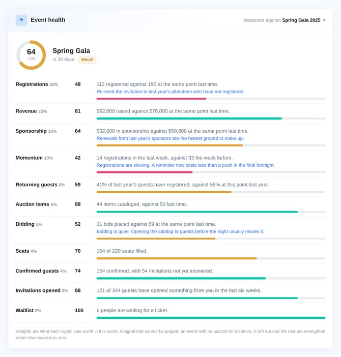
| SIGNAL | WEIGHT | SCORE | WHAT IT SAYS |
|---|---|---|---|
| Registrations | 25% | 48 | 112 registered against 190 at the same point last time. Re-send the invitation to last year's attendees who have not registered. |
| Revenue | 25% | 81 | $62,000 raised against $76,000 at the same point last time. |
| Sponsorship | 10% | 64 | $32,000 in sponsorship against $50,000 at the same point last time. Renewals from last year's sponsors are the fastest ground to make up. |
| Momentum | 10% | 42 | 14 registrations in the last week, against 33 the week before. A reminder now costs less than a push in the final fortnight. |
| Returning guests | 8% | 59 | 41% of last year's guests have registered, against 55% at this point last year. |
| Auction items | 5% | 88 | 44 items cataloged, against 50 last time. |
| Bidding | 5% | 52 | 31 bids placed against 59 at the same point last time. Opening the catalog to guests before the night usually moves it. |
| Seats | 4% | 70 | 154 of 220 seats filled. Follow up with table captains on unsold seats. |
| Confirmed guests | 4% | 74 | 154 confirmed, with 54 invitations not yet answered. |
| Invitations opened | 2% | 88 | 121 of 344 guests have opened something from you in the last six weeks. |
| Waitlist | 2% | 100 | 6 people are waiting for a ticket. Release seats to the waitlist as cancellations come in. |
Those eleven weights sum to 100, and the example above produces 64 out of 100 for a Spring Gala 38 days out, which reads as Watch rather than On track or At risk.
Read it by weight rather than by score. Waitlist scored a perfect 100 and is worth two points; Registrations scored 48 and is worth twenty-five. The two low scores that actually made this a 64 are Registrations and Momentum, and both have five weeks left in which they can still be moved.
A signal that cannot be judged is left out, not scored zero. An event with no auction is not a badly run auction. When a signal is dropped, the remaining weights are redistributed across the signals that did apply, which is why the weights you see on your own event may not match the ones above.
What it is comparing against
Every score is relative to one specific past event, named under the heading: "Measured against Spring Gala 2025." Better.AI picks that event itself, preferring an obvious name match, then an event at the same time of year, then simply your most recent comparable one.
You can override it. The comparison event is a searchable dropdown listing your past events, and choosing a different one rescores every signal against that event instead. That choice is remembered, so next year's gala keeps measuring itself against the gala you told it to.
If a name-matched or seasonal match cannot be found, the screen says which basis it fell back to rather than presenting a loose match as a firm one. A brand new event with no history has nothing to compare against, and says that too.
What you see on your own plan
All five screens are visible to everyone, whether or not Better.AI is switched on for your organization. Without it you see a worked example like the ones above, clearly labeled as an example, so you can judge whether the feature is worth having before committing to it.
With it, the same screens fill with your own data. Some plans include a set number of findings or generated artifacts, and where a limit applies the screen says how many you have left and how many findings are ranked below the ones shown, rather than quietly truncating the list.
Every figure on all five screens comes from your own records, and every one of them is shown to you alongside the finding it produced. Nothing here asks you to take a number on trust.